Grainger
Grainger Terms Management
Grainger Terms Management
Grainger is an American Fortune 500 industrial supply company with over 1.6 million products. In order to efficiently get products to the hands of customers, Grainger has built a proprietary search engine and product information management system.
My role:
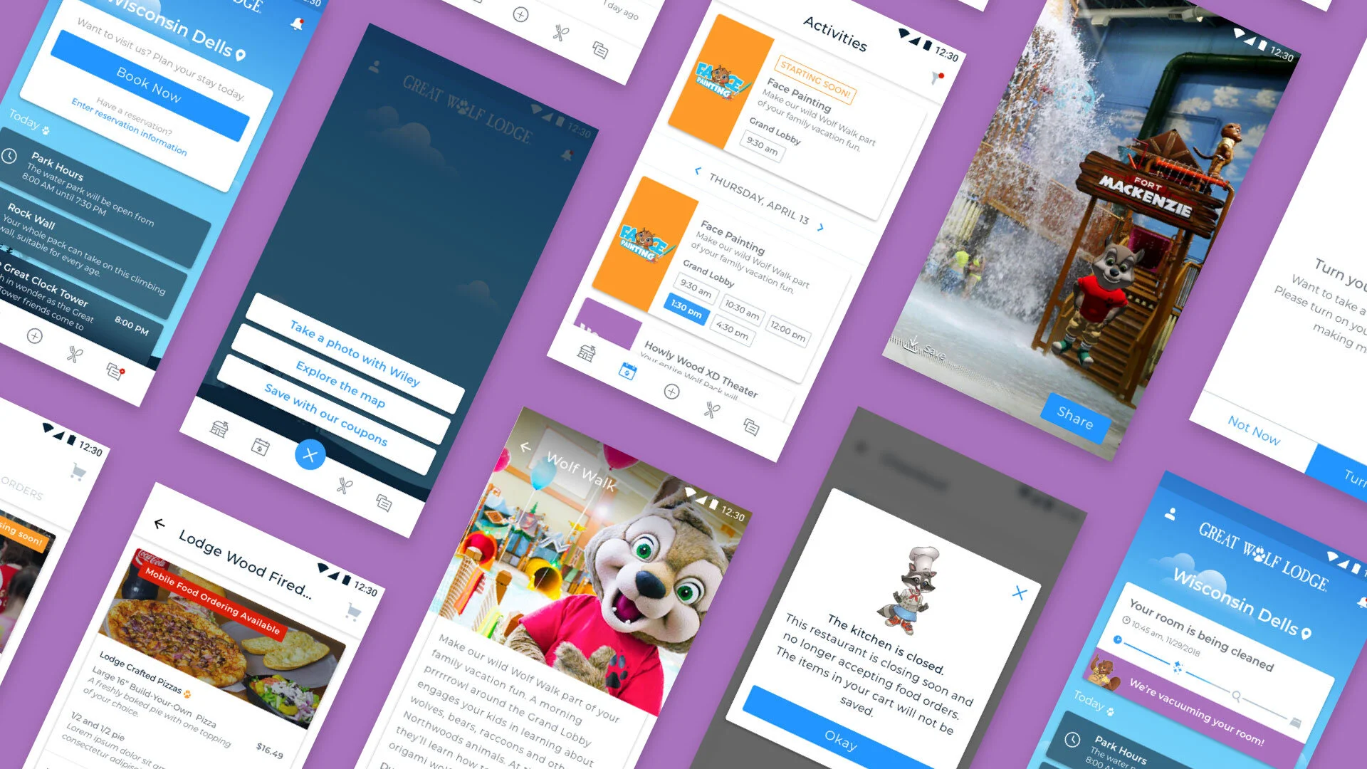
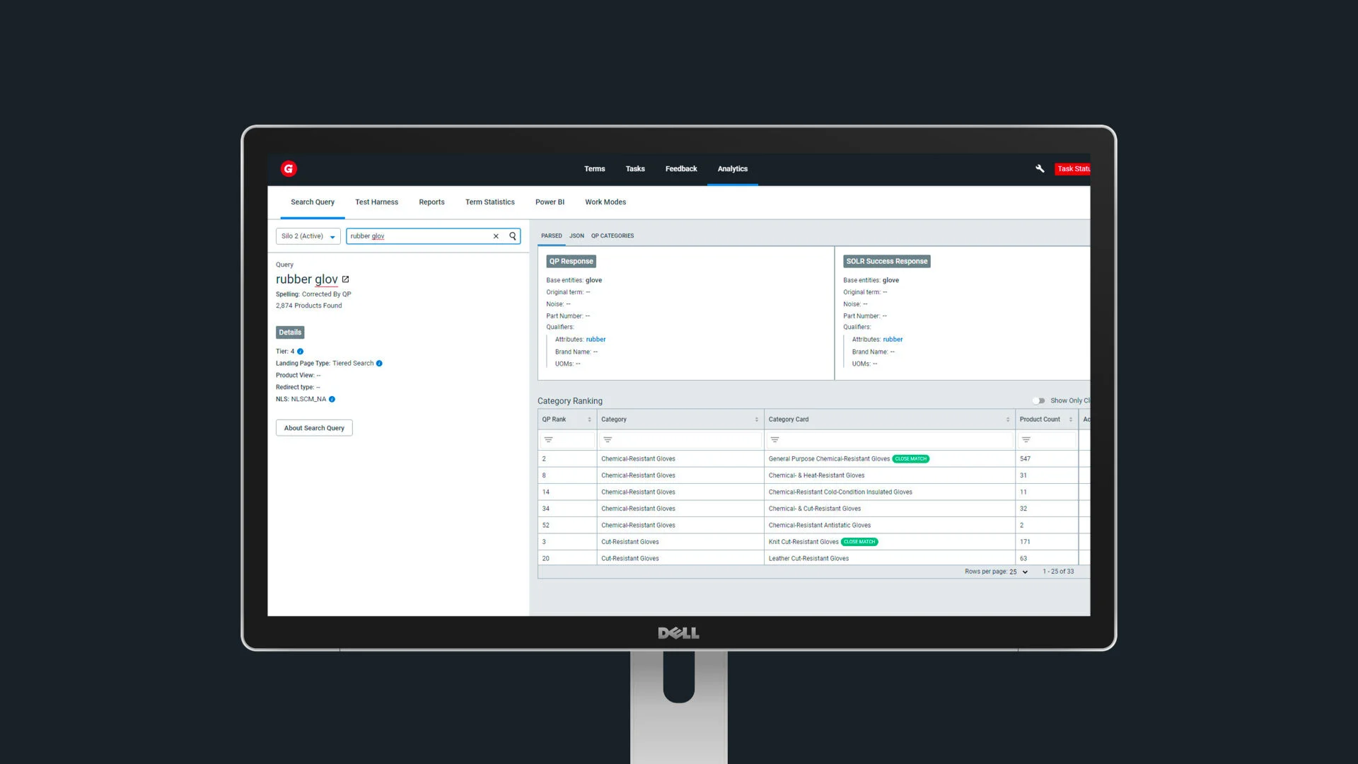
Over the course of 2 years, and over 25 releases, I was part of the team building the Terms Management Tool (TMT) for Grainger.com. This system creates linkages between terms (or nouns) and products, a key component to the search experience on Grainger.com. A group of online search analysts use the tool to add new terms to the product web hierarchy as well as compare products and view search analytics. For example, a user searches “rubber glove” on grainger.com, the term “rubber glove” is linked to about 559 products. The logic as to why certain products appear is thanks in part to the TMT.
Team size: 1 Product Designer, 1 Product Manager, 1 Business Analyst, 2 Software Architects, 10 Software Engineers

Screenshot of Miro Board used to collaborate with cross-functional team
After the MVP release, we spoke to 5 Online Search Analysts to gather feedback on the new tool. We heard that OSAs try to establish consistent linking across similar SKUs. However, it was not possible to compare products via the current user interface - an OSA had to download product data, paste it into excel and do that at least 15 times over. Additionally, the tool was lacking actual product images, so it was even harder to scan and compare products.
I led a whiteboarding session with my Product Manager, Business Analyst, and one Front-End Engineer. We sketched various ideas on how comparing would function in the TMT. Then, I put together a simple clickable prototype to validate with our main client stakeholder. Our client reacts more positively to something he can actually see as opposed to writing the user story. He’s also our champion so it was important to get his buy-in before we moved to deliver a brand-new feature. After the launch of the new Compare feature, we ran another series of user interviews and heard time and time again how helpful it was to view product data side-by-side.

Compare Results screen - there’s an ability to view a particular SKU on Grainger.com. This was the first iteration of how to view a product’s image. In a subsequent release, we included thumbnail images for each SKU.
46 Sprints, 25 releases, 15 users, 600 hours saved
When we started our engagement with Grainger back in 2019, we were repurposing a lot of functionality from an existing platform used by Gamut, Grainger’s former subsidiary. Starting with a stable foundation, we were able to enhance the functionality. Through user research - contextual inquiries, user interviews, and surveys - we were able to improve the usability and add functionality to the tool over time.

In an effort to quantify usability, we decided to send out surveys every 2-3 weeks. We had sent surveys in the past, but they were mainly to get feedback on specific features. This time, it was on the tool as a whole. We structured our survey questions around Nielsen Norman’s 10 Usability Heuristics. Additionally, we spoke to 3-4 Online Search Analysts a month, for 30 minutes each. The purpose of those supplementary interviews was to get more details around some of the results we were seeing.

Survey results over a period of 4 months

Some of the UI updates made coming out of the usability surveys.